Putting
a
name
on it
a
on it
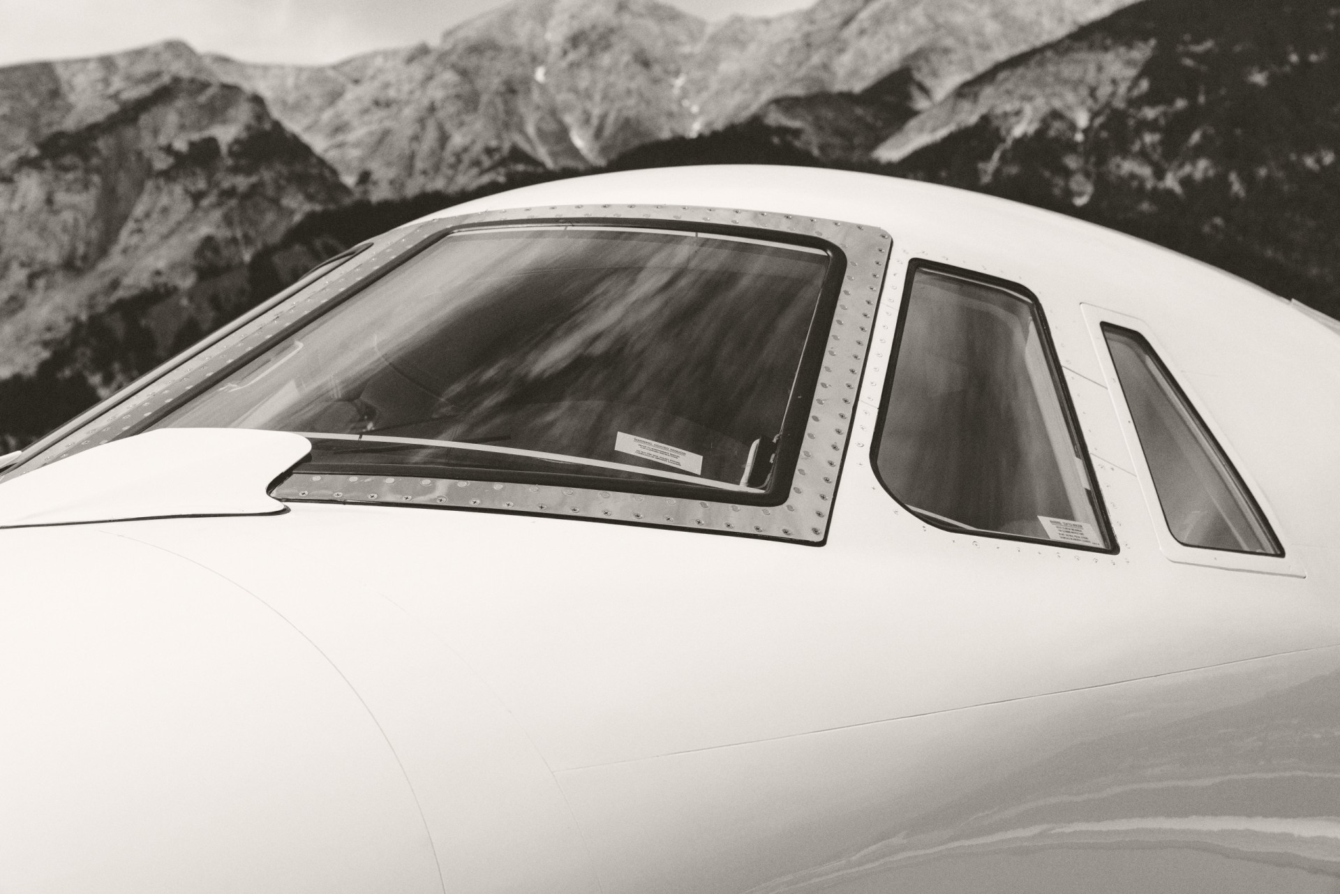
We started our rebranding process to make the new era of TJS come alive. But we didn’t stop at a new font, we took everything one step further: What used to be Tyrolean Jet Services is now Tyrolean Jets & Services. Changing a well-known name is always a major matter (and yes, we are aware that we only added one small word) but one we considered to be worthwhile. Our former handle implied that our core business is supporting services when in fact our core has been and still is business jet operation. Flying under the name Tyrolean Jets & Services makes this clear at first glance and simultaneously differentiating our business fields has become easier for us. A true win on the name base for us!
Making change visible
A new logo that feels like TJS


And Tyrolean Red – bold, authentic, timeless. Like the heritage we carry with us wherever we fly.
We are hugely appreciative of our new look & feel… does it show?
